
Using Pardot Lightning Email Builder

How Easy Is It to Build A New Template?
Using the Pardot Lightning Email Builder is super easy! There are lots of drag and drop email template builders available (we’re sure you have your favourite) and this new functionality within Pardot is no different. If you’re familiar with email drag and drop builders then you a lot of this will likely be familiar to you.
Let’s run through the standard components available.
Standard components available to use are; Button, HTML, Image, and Rich Text. For details regarding creating custom components please click here for a related licenced Salesforce article. Pre-built custom components are also available for download on the AppExchange.
Selecting whichever component you wish to add, it can be dragged to where you would like to place it. See, we weren’t lying when we said it was easy!
Before we go any further, it would be worth noting at this stage that a pre-header must be entered in box 1 below.
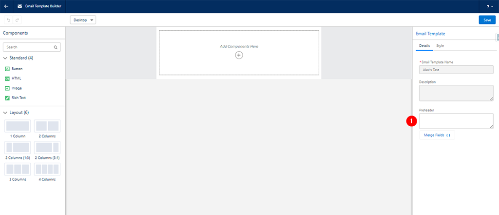
Some other functions available within the Lightning Builder are (please refer to the screenshot below);
1) This enables you to select whether the email template you’re viewing is for Desktop or Mobile.
2) For Pardot users without CMS (Content Management System), this is where you can paste the URL for the asset stored in Pardot. Please note that you may need to amend ‘http’ to ‘https’.
3) This dropdown allows you to select Salesforce Files to use (CMS users only).
4) If you would like to add a link to an image, button, etc, this is where you can designate the redirect.
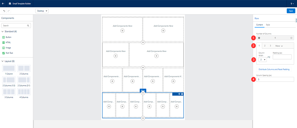
When it comes to adding or changing sections, you have various options available;
1) You can add (or remove) columns, up to a maximum of 6.
2) Here you can select which column you would like to specifically amend.
3) You can set the width of each individual column here. It’s in a total multiplication of 12, so you can have 6 columns at 2, 4 columns at 3, 3 columns at 4 etc. If you want 5 columns then this could pose a slight issue, as 12 divided by 5 doesn’t equate. We’re sure you get the idea.
4) This is where you can select the spacing for each individual column.
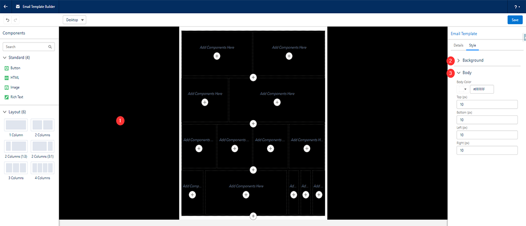
When it comes to adding background colour, you can click anywhere on the background (1) and go into the Background (2) settings. What is not so easy to see, however, is that to change the colour of the border (seen in white below), you have to select ‘Body’ (2). You can select individual colours for each individual sections, which can be done using the same method as the background colour – but please note that it’s not possible to colour each column seperately.
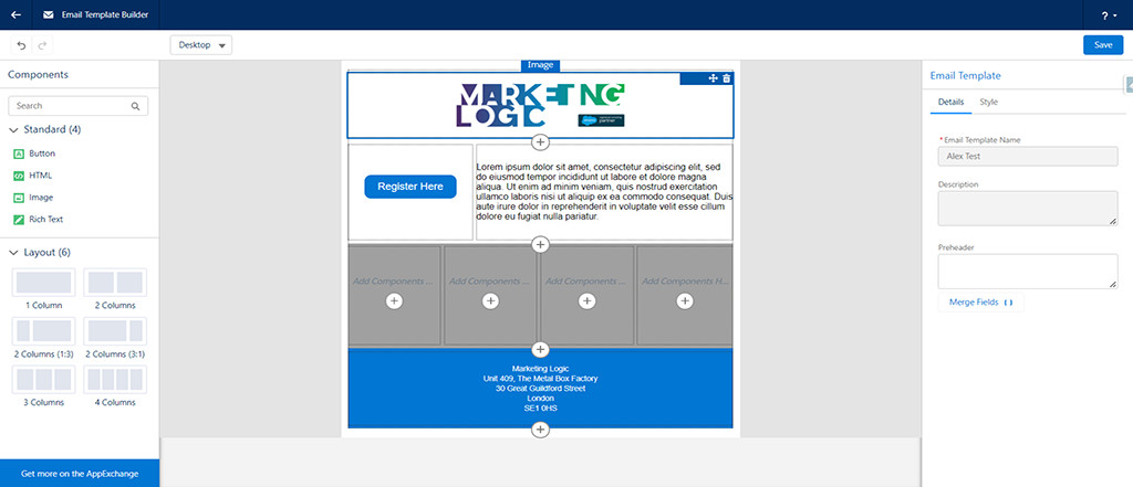
As you can see from the example below, it’s possible to build out the body of the template in very little time (please don’t judge us on the styling, this template was created purely for the purpose of this article!).
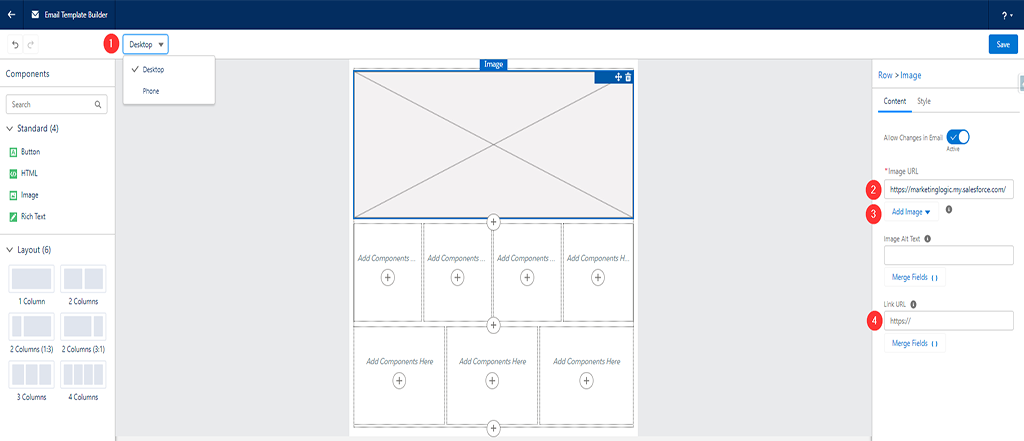
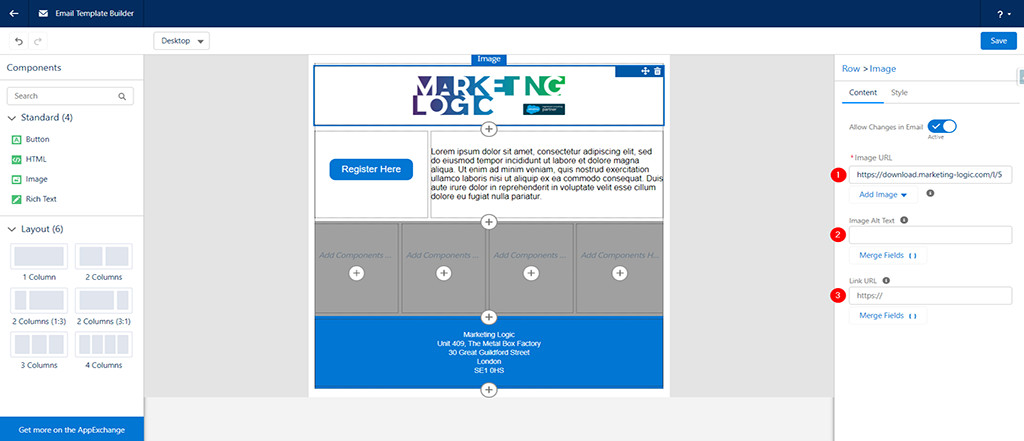
Starting from the image at the top; (1) is where you designate the file location within Pardot, (2) is where you can provide Alt Text for the image, and (3) is where you can set a redirect if a user clicks on the image.
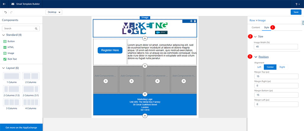
Now let’s move on to styling the image. With the image selected, click on (2) ‘Style’ and you will see 2 options with dropdowns – Size and Position.
We hate to state the obvious, but for the size, if this is set to 100 then the image is full width. Under ‘Position’ you then have the option of setting where the image sits (in our case, centre) and the size of the margins you wish to use.
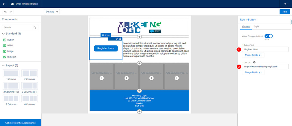
When it comes to adding Buttons, you have a number of options. You can rename the button (1) and select the URL (2) where you want users to be redirected once they click on it.
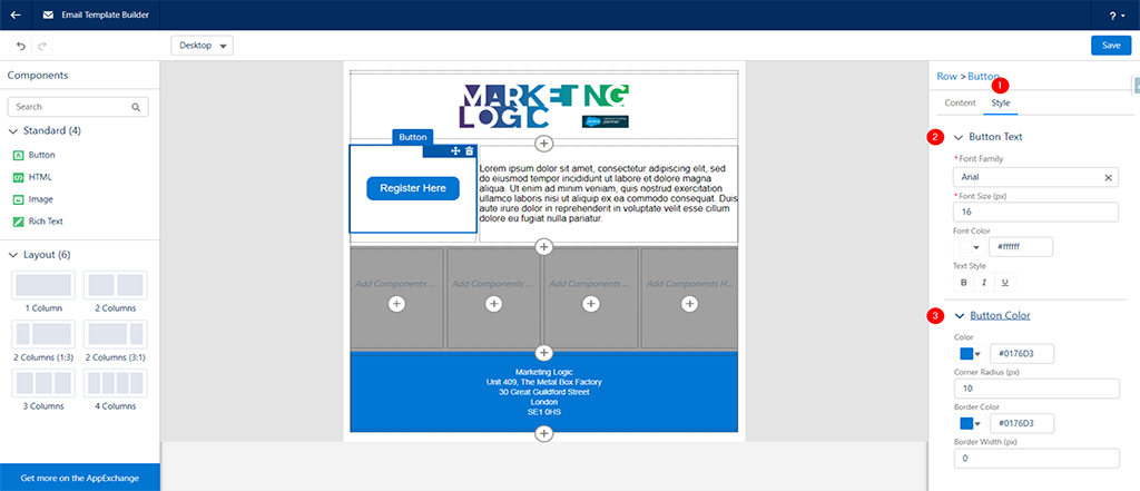
You then have quite a few options when it comes to styling the button (1). Button Text (2) is where you select the font, size, text colour and Text Styles used for the button, and Button Colour (3) is where you choose the colour of the button and its border.
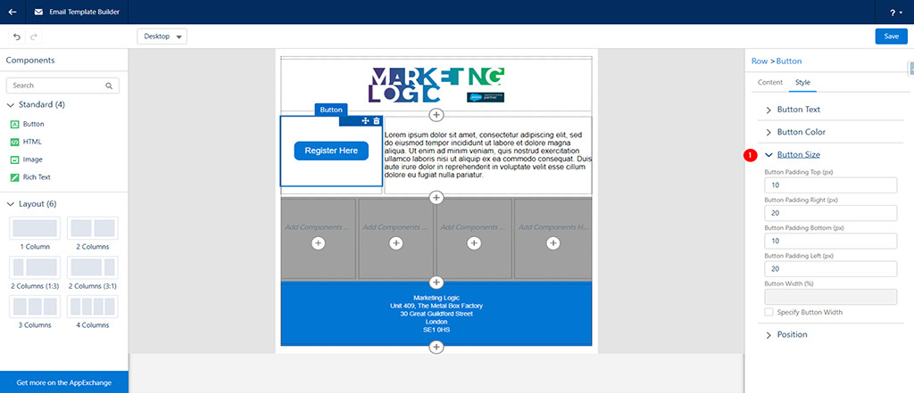
And that’s not all. You can specify the size of the button (1) through adding padding, or alternatively, you can tick the checkbox (Specify Button Width) and set the width as a percentage of the column instead.
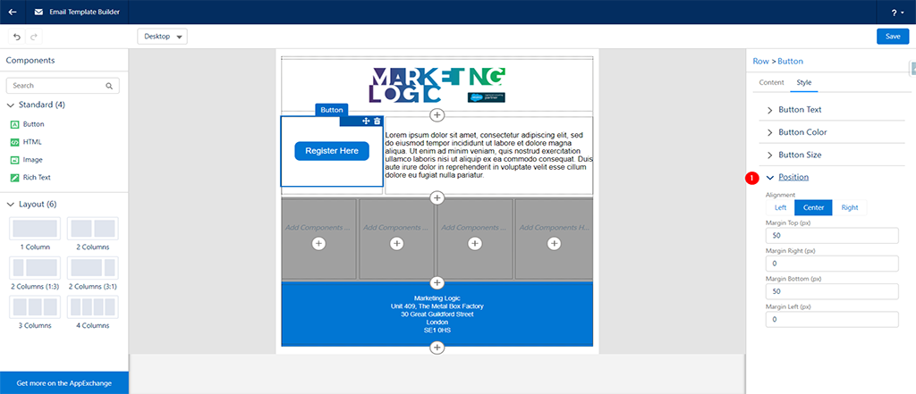
And finally, you can set the position (1) of where you would like the button to sit within the column, whilst also having the ability to add margins as desired.
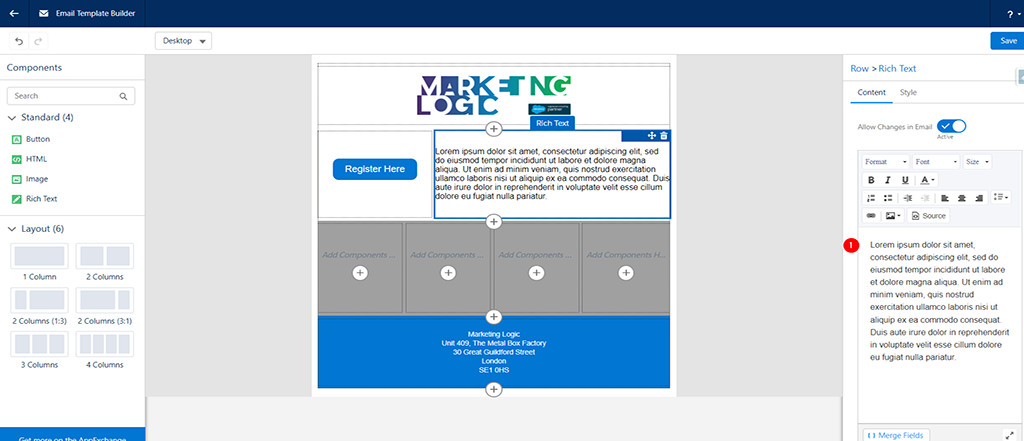
When it comes to adding text, you will see the options available are quite extensive – being not too dissimilar to Word.
You can add your text within the box (1) and then set the size, font, styles, hyperlinks and images (plus much more). It’s also possible to add html, if you so wish.
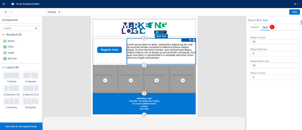
You can then style (1) this text box by adding margins. It really couldn’t be any easier.
The only other standard component we haven’t touched on is html. We haven’t included this as it’s such a vast subject and information is readily available online.
So there you go, we said the new Pardot Lightning Email Builder was easy to use, and we hope you think so too.
Now you have the power to create some powerful and highly attractive email templates!
We hope you enjoyed this article and found the information to be beneficial. If you would like to read more of our articles, then please click here.